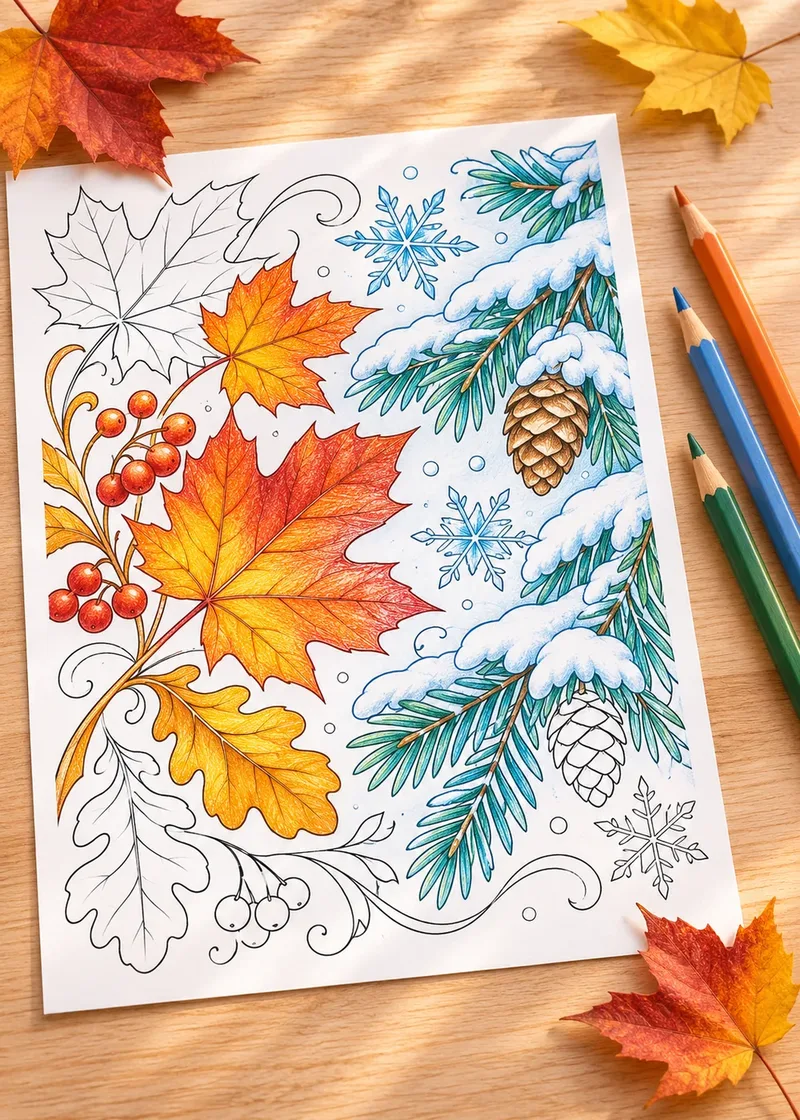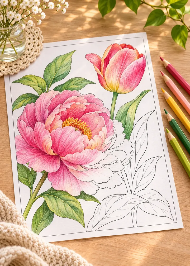
Flowers are probably the most colored subject in the world, and one of the easiest to make look flat. A rose filled with a single red reads as a symbol of a rose. The same rose with a darker heart, softer edges and light on the outer petals looks like something you could pick.
Learning how to color flowers with colored pencils realistically takes a handful of habits rather than talent. This guide covers them in order: light, palette, petals, centers, leaves and highlights, then gives color recipes for four favorite flowers.
In short
- Pick a light direction and stick to it.
- Use three values per flower and one shared shadow color.
- Shade petals dark at the base and light at the tips, along their curve.
- Give centers texture and leaves at least two greens.
- Finish with saved and added highlights.
Decide where the light comes from
Before you touch a pencil, pick a direction for the light. Top left is the usual choice, but any direction works if you keep it. Three rules follow:
- Surfaces facing the light are lightest. A petal edge curling toward the light stays pale.
- Surfaces turned away are darker. Undersides and the far side of the bloom get more layers.
- Where shapes overlap, there is shadow. Where one petal tucks behind another is the darkest spot.
Draw a small arrow in the margin. It saves you from shading one petal from the left and the next from the right.
Choose a small palette for each flower
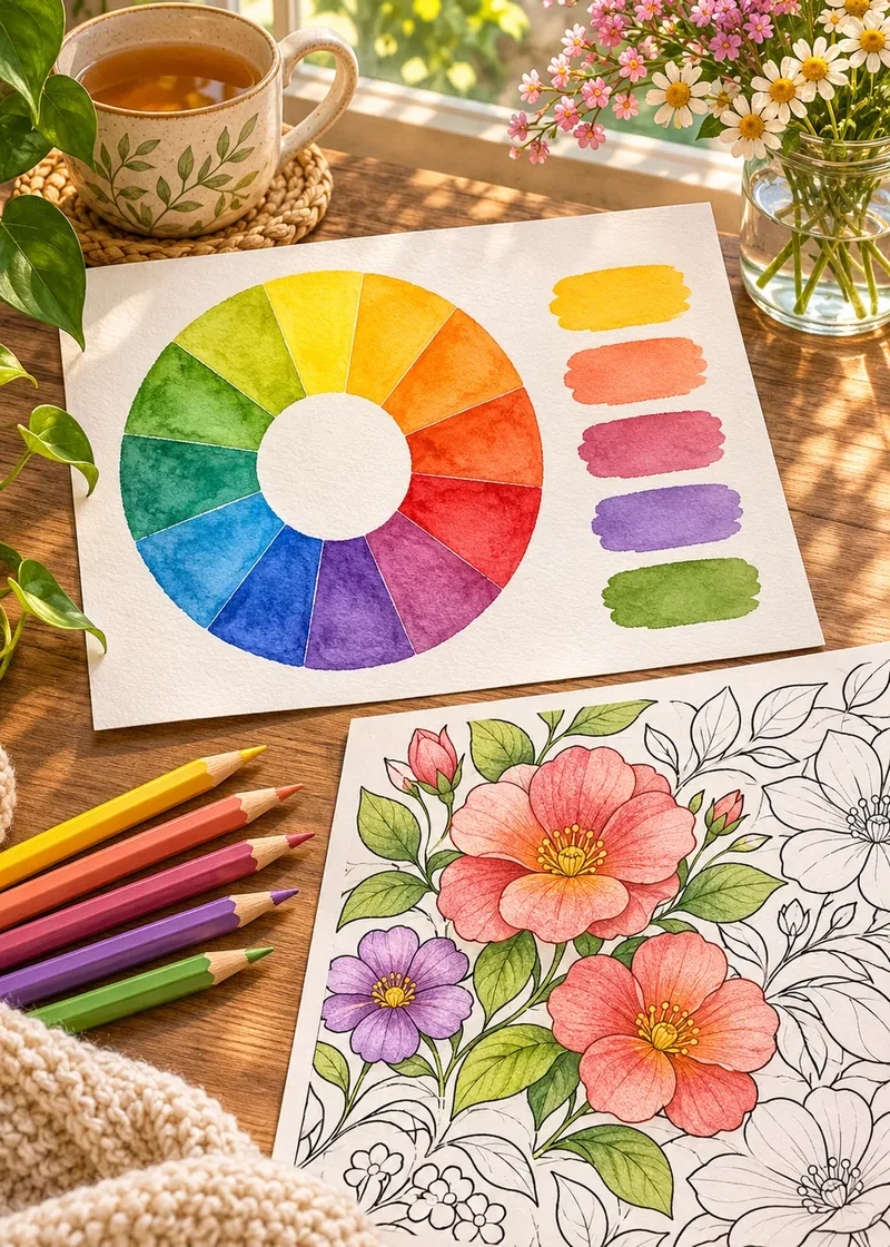
Realistic does not mean using every pencil you own. Three values of one color family per flower are enough:
| Flower | Light | Middle | Dark |
|---|---|---|---|
| Pink rose | Pale blush | Rose pink | Crimson or wine |
| Sunflower | Lemon yellow | Golden yellow | Orange or ochre |
| Tulip | Light coral | Tomato red | Deep red |
| Purple iris | Lavender | Violet | Deep purple or indigo |
| White daisy | Paper white | Cream | Cool gray or pale blue |
Add one shadow color shared by the whole page, such as soft violet or cool gray. Repeating it in every flower ties the composition together, the way a single light source does. For more on building sets, see how to choose a color palette.
How to shade flower petals
Most petals are darker where they meet the center and lighter toward the tips. That gradient does most of the work.
Shading one petal
- Lay a light base. Cover the whole petal with your lightest color in gentle strokes.
- Add the middle color. Work it over the inner half, easing off the pressure toward the tip.
- Add the dark color. Place it only at the base and where another petal overlaps.
- Soften the transition. Go back over the join with the light color and firm pressure.
Color along the length of the petal, from base to tip, following its curve. Those strokes mimic the fine veins of real petals and make the shape look rounded. The guide on how to shade coloring pages covers the same idea on spheres and cylinders, and colored pencil blending for beginners explains pressure control.
Give the flower center real texture
The center is where the eye goes first.
- Dotted centers, like sunflowers and daisies, look best in small dabs: dark dots on the shadow side, lighter ones facing the light.
- Layered centers, like roses and peonies, are tighter petals. Shade them the same way, with more contrast.
- Stamens and thin details can stay pale. Color around them, then fill them with cream or pale yellow.
A touch of a complementary color in the deepest shadow adds richness: a dot of green in the heart of a red rose, or a whisper of purple at the base of yellow petals.
Flower color recipes: rose, sunflower, daisy and tulip
Rose. Darkest deep in the spiral, lightest on the outer petal rims that curl outward.
- Pale blush
#F6D3D8petal rims - Rose pink
#E07A93petal bodies - Crimson
#A3203Finner spiral - Soft violet
#7A6A9Eshared shadow
Sunflower. Petals lighter at the tips, a dark brown center in dabs, with a ring of orange where petals meet the disk.
- Lemon yellow
#F8E45Cpetal tips - Golden yellow
#F2B631petal bodies - Ochre
#C9821Epetal bases - Dark brown
#4A2E1Cseed disk
Daisy. Leave most of each petal as bare paper. Shade only the base and overlaps with cool gray or pale blue, and give the yellow center a darker side.
Tulip. Shade the cup like a cylinder: lighter down the front, deeper on both sides and inside the opening. Light coral, tomato red and deep red work for red tulips.
White flowers
Do not try to color white flowers white. Leave the paper bare and shape the petals with pale gray, cream or blue in the shadows only.
Color leaves and stems with more than one green
Leaves lose realism when every one gets the same green. Real foliage has yellow greens, blue greens and olive tones, often on one plant.
- Choose two or three greens: one warm, one cool, one dark.
- Color leaves near the light warm, and leaves further back cool.
- Leave the central vein lighter. Color on either side, following the small veins.
- Darken the half facing away from the light, and where the leaf meets the stem.
Stems are cylinders: a thin line of your darkest green along the shadow edge is often enough.
Add soft highlights and edges
Saved highlights are areas you never colored: plan them early. Added highlights go on top: a white or cream pencil pressed firmly softens and lightens an area, and a white gel pen gives a sharp accent for dew drops.
Watch the edges too. Against a dark background, a light petal edge glows; flowers on black are covered in our guide on how to color backgrounds. Against a light background, a few strokes of the middle color along the rim help the petal stand out.
Common problems and quick fixes
- Flat petals: darken the base one more layer and lighten the tips with white pencil.
- Waxy, shiny areas: you pressed hard too early. A final light layer can calm the shine.
- Every flower looks the same: give front petals less shadow and back petals more.
- Leaves compete with blooms: use duller, cooler greens and save saturated colors for flowers.
Start on a design with large petals, such as a single tulip, and print two copies: test the palette on the first, take your time on the second. Free coloring pages are perfect for this.
Frequently asked questions
What colored pencil colors do I need for flowers?
For each flower, three values of one color family, plus two or three greens and one shared shadow color such as soft violet or cool gray.
How do you make colored pencil flowers look realistic?
Keep one light direction, shade petals darker at the base and lighter at the tips, and stroke along the curve of each petal.
How do you color a white flower?
Leave most of the paper white and shade only the overlaps and the base of the petals with pale gray, cream or light blue.
Should I outline flowers in a darker color?
Usually not. A few strokes of the middle color along the rim separate a petal from its background more softly than a dark outline.
What background works best behind colored flowers?
A pale, quiet tint or a dark background both work. Avoid a busy background in saturated colors that compete with the blooms.