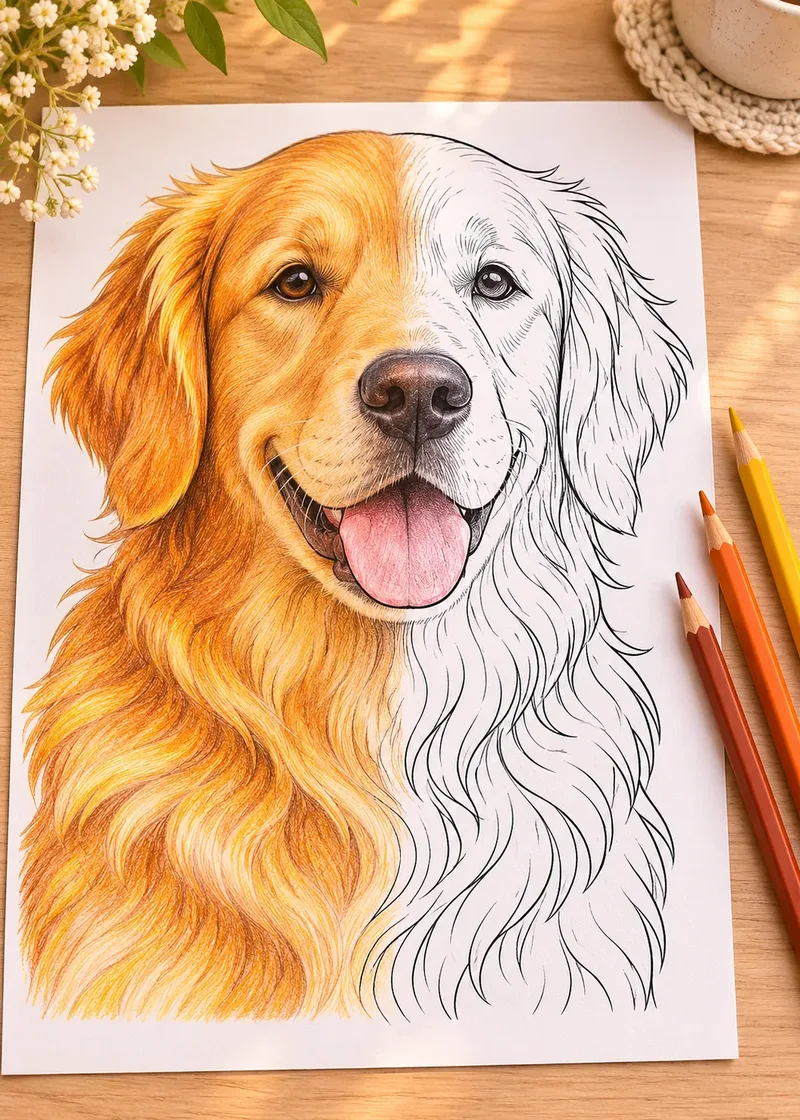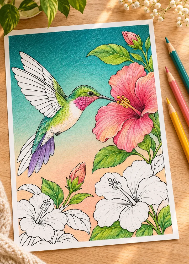
You have finished the flowers, the dog or the planet, and now a big empty space stares back at you. Learning how to color backgrounds on coloring pages is mostly about one decision: what the background should do for your subject. Once you know that, the right technique is easy to pick, and the empty space stops feeling like a test.
This guide starts with that decision, then walks through eight background ideas, from a single soft tint to a deep night sky, with exact steps for colored pencils and markers. You will also find how to avoid streaks on large areas, whether to color the background first or last, and how to rescue a background that took over the page.
In short
- Leaving the background white is a real choice, not a failure.
- A background should be lighter, darker, duller or cooler than the subject, never all four the same.
- Light pressure, small circles and several thin layers give smooth pencil backgrounds.
- With markers, work in small sections and keep a wet edge.
- When in doubt, test the color on a scrap of the same paper first.
Should you color the background at all?
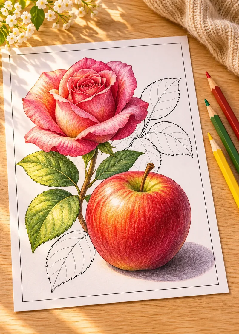
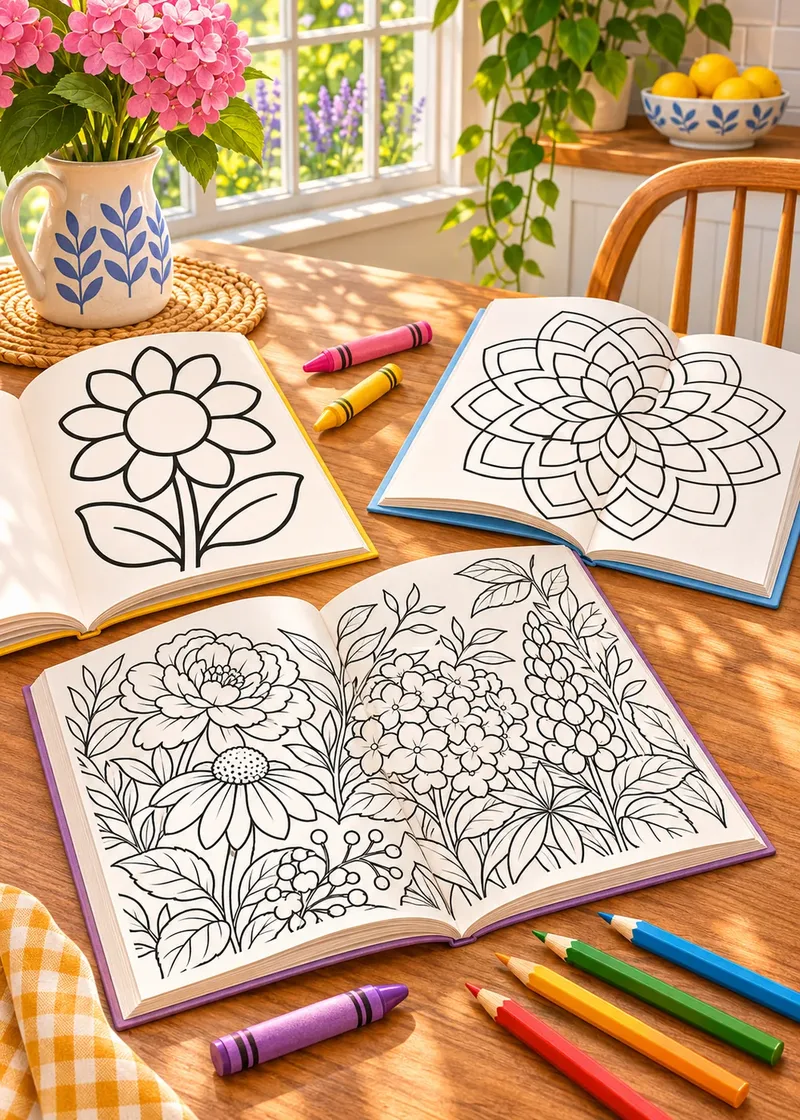
Not always. Many coloring designs are drawn to sit on white paper: mandalas, dense pattern pages and detailed botanical studies often look cleaner with the white left open. White also reads as light, so it makes colorful subjects look brighter.
Color the background when the page feels unfinished, when the subject floats with no sense of place, or when you want a mood: dusk, a snowy morning, a summer field. A background is also the quickest way to make a light subject stand out, because nothing frames a pale shape like a darker area behind it.
Use this decision guide before you pick up a pencil:
| Option | Best when | Effort | Watch out for |
|---|---|---|---|
| Leave it white | Mandalas, busy patterns, bright subjects | None | Pale subjects can fade into the paper |
| Soft single tint | Portraits, animals, simple scenes | Low | Uneven pressure shows on large areas |
| Gradient | Skies, landscapes, seasonal scenes | Medium | Hard bands where colors meet |
| Halo | One clear subject in the center | Low | A halo that is too wide or too dark |
| Pattern | Plain pages that need interest | Medium | Patterns that compete with the subject |
| Dark background | Light, glowing or night subjects | High | Smudging, waxy shine, ink use |
Rule one: the background serves the subject
The subject should win, and the background should help it win. Contrast does that work, and you can create contrast in three ways. You only need one or two of them at once.
- Value (light vs dark). A dark background behind a light subject, or the reverse. This is the strongest tool you have. Squint at the page: if subject and background melt into the same mid-tone, change the value.
- Temperature (warm vs cool). Warm colors (reds, oranges, yellows) tend to come forward; cool colors (blues, blue-greens, violets) tend to sit back. A cool background behind a warm subject adds depth even on a flat page.
- Saturation (bright vs muted). A vivid subject in front of a softer, grayer version of a color reads as the star. Muted backgrounds are the safest choice for busy pages.
For choosing the colors themselves, our guide on how to choose a color palette explains color harmonies in more detail.
Plan it before you start
Even if you color the background last, choose its color before you begin the subject. It changes how every other color on the page looks, and you may want to repeat a hint of it in the subject’s shadows to tie the two together.
Eight ideas for coloring page backgrounds
Each idea below works with colored pencils, and most work with markers too. Try one per page rather than mixing several.
1. A soft single tint
The easiest upgrade. Pick one light color that sits well with the subject, such as pale sky blue behind a golden dog or soft blush behind green leaves. Use very light pressure and small overlapping circles, and keep the whole area at the same pressure. Two light layers look smoother than one heavy layer.
2. A vertical gradient
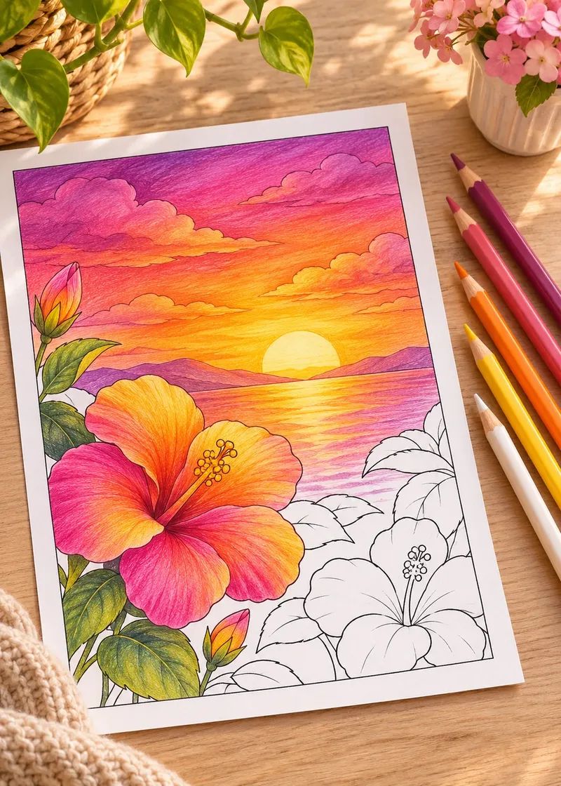
Ideal for skies. Start with the darkest color at the top and fade toward the horizon: deep blue, then medium blue, then a pale warm color near the ground. Overlap each band by about an inch and blend the overlap with the lighter color, so there is no visible line. For the blending itself, see colored pencil blending for beginners. The same fade works upside down for water: see coloring ocean scenes.
- Deep blue
#2E4A7Dtop of the sky - Periwinkle
#7D8FC9middle band - Lavender
#C9B8E0lower sky - Peach
#F6C7A1horizon glow - Cream
#FBF1DCnearest the ground
3. A halo around the subject
Color a band of color around the outline, about half an inch to an inch wide, and fade it to white as you move outward. You do not need to fill the whole page. A halo frames the subject, hides an uneven edge and takes ten minutes instead of an hour. It works especially well on portraits and single flowers.
4. A complementary color
Complementary colors sit opposite each other on the color wheel: blue and orange, red and green, yellow and violet. A muted version of the subject’s complement makes it vibrate. Behind an orange fox or a red rose, a soft blue-green or sage background is a classic choice. Keep the background lighter or duller than the subject so the pair does not fight.
5. A dark background, light subject
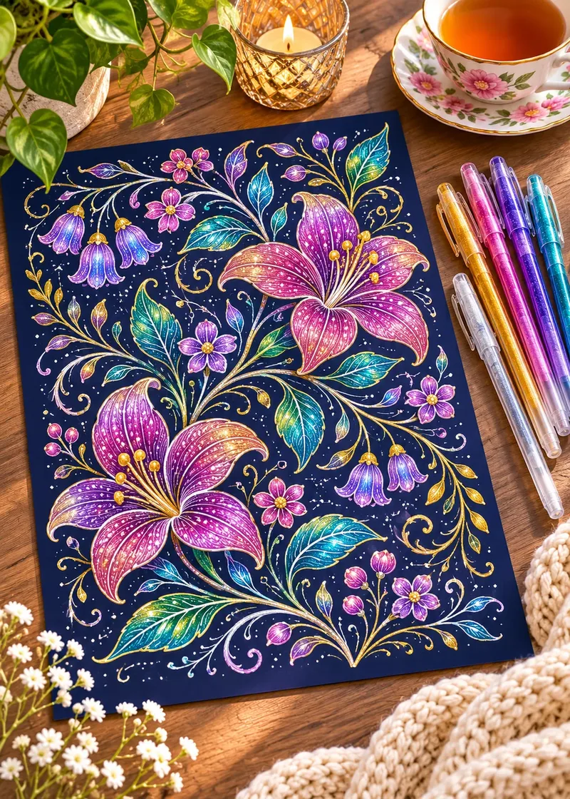
Dark blue, deep plum or near black behind pale shapes gives a dramatic, glowing result. It suits night gardens, moons, fireflies and space scenes. Color the subject first, then darken around it in several layers, turning the page so your hand rests on areas you have not colored yet. White or light gel pen dots on top become stars. Our space and night sky color palettes give tested combinations for deep skies, and coloring with gel pens covers the dots and highlights.
- Midnight navy
#1B2340main background - Deep plum
#3E2A4Fcorners - Dusky teal
#24494Fbehind leaves - Soft moonlight
#E8E6D9subject highlights
6. A simple pattern
When a page has plain open space, a light pattern adds interest without much effort: small dots, thin diagonal stripes, tiny stars, little hearts or a check. Draw the pattern in a light color, keep the shapes small and evenly spaced, and leave the area right around the subject calmer. The pattern pages in our free coloring pages library are good practice for repeating small shapes.
7. Texture: stippling and hatching
Texture backgrounds use marks instead of flat color. Stippling means many small dots: denser dots read darker, sparse dots read lighter, so you can fade from dense near the subject to sparse at the edges. Hatching means short parallel lines, all in the same direction; crossing a second set of lines over the first (cross-hatching) makes it darker. A fine-tip pen or a sharp pencil works best, and the result has a pleasant handmade feel.
8. One neutral for busy pages
Some pages have no single background, only dozens of small leftover shapes between the motifs. Filling each one with a different color makes the page look noisy. Fill all of them with one quiet neutral instead: warm gray, soft taupe, dusty blue or pale sage. The motifs pop forward and the page suddenly looks planned.
How to color backgrounds smoothly by tool
Large areas reveal every change of pressure, so technique matters more here than anywhere else on the page.
Colored pencils
A smooth pencil background
- Sharpen and test. Use a sharp point and test your color on a scrap of the same paper.
- Go light first. Cover the area with very light pressure in small overlapping circles, not back-and-forth lines.
- Turn the page often. Work in a comfortable direction so your strokes stay even.
- Add layers, not pressure. Build depth with a second and third light layer instead of pressing harder.
- Blend at the end. Smooth the surface with a colorless blender pencil or a white or cream pencil once the color is where you want it.
Heavy pressure early on flattens the paper’s tooth, the tiny texture that holds pigment, and later layers then slide off. Paper choice helps too: a smooth, heavier paper takes layers better than thin copy paper, as explained in our guide to the best paper for printing coloring pages.
Markers
Markers streak on big areas because the edge of one stroke dries before the next stroke overlaps it, and the dried overlap shows as a darker line. To avoid that:
- Work in small sections, such as the space between two outlines, and finish each section in one go.
- Keep a wet edge: overlap each new stroke into the still-wet one.
- Use small circular motions or flick strokes rather than long straight lines.
- Put a scrap sheet under the page, since alcohol markers bleed through most paper.
- For a whole-page background, consider switching to colored pencils over a light marker base.
If you color mostly with markers, our guide to coloring books for markers covers paper and single-sided pages.
Tip
On a very large area, a pencil background over a single light marker layer is often the smoothest and fastest option: the marker gives even coverage, and the pencil adds depth on top.
Background first or last?
Both work. The best choice depends on your tools and on how confident you feel about the color.
| Order | Pros | Cons |
|---|---|---|
| Background first | No risk of smudging a finished subject; easy to lighten later | You choose the mood before seeing the subject |
| Background last | You can match it to the finished subject | Risk of going over edges or smudging details |
A good middle path: lay a very light first layer of the background early, color the subject, then deepen the background at the end. If you work last, outline the edges of the subject first with a sharp pencil in the background color, then fill outward from that safe edge.
Fixes when the background took over
It happens to everyone: the background ends up darker or brighter than the subject, and the page feels heavy. Before you give up on it, try these fixes, roughly from gentlest to strongest:
- Lift some color. Press a kneaded eraser or a piece of removable tape onto the pencil area to lift a little pigment.
- Darken the subject’s edges. A slightly deeper shadow along the subject’s outline separates it from the background again. Our guide on how to shade coloring pages shows where shadows go.
- Add highlights. A few white gel pen highlights on the subject bring it forward.
- Mute the background. A light layer of its complementary color, or of a soft gray, dulls a background that is too loud.
- Turn a mistake into texture. A streaky area can become stippling or a pattern drawn on top.
More rescue techniques are in how to fix coloring mistakes.
The squint test
Step back and squint at your page. If the subject is the first thing you notice, the background works. If your eye goes to the background first, lighten it, mute it, or deepen the subject’s shadows.
Background ideas for animals and space pages
Animal portraits look best with calm backgrounds: a soft tint, a halo, or a gradient from a muted color near the animal to white at the edges. A warm golden or brown coat glows against cool blue-gray; a black or dark coat stands out against a pale warm tint. If you are working on a portrait, pair this guide with how to color dog fur.
Space pages are the opposite: they almost ask for a dark background. Start with deep blue or violet rather than pure black for a richer sky, keep a lighter glow around planets and stars, and add white dots last. A starry page from our free printable coloring pages is a good place to practice.
Frequently asked questions
Should I color the background before or after the subject?
Either works. Coloring it first avoids smudging a finished subject, while coloring it last lets you match it to the subject. Many colorists lay a light first layer early and deepen it at the end.
How do I color a large background without streaks?
With colored pencils, use light pressure, small overlapping circles and several thin layers instead of pressing hard. With markers, work in small sections and overlap each stroke while the previous one is still wet.
What color should a background be?
Choose a color that contrasts with the subject in value, temperature or saturation: darker or lighter, cooler, or more muted. A soft complement of the subject’s main color is a reliable choice.
Is it okay to leave the background white?
Yes. Many designs, especially mandalas and detailed patterns, are meant to sit on white paper, and white makes bright colors look even brighter.
How do I make the subject stand out from the background?
Increase the contrast between them. Make the background lighter, darker or duller than the subject, deepen the shadows along the subject’s edges, and add a few highlights on the subject itself.
What is the easiest background for beginners?
A halo: a band of soft color around the subject that fades to white. It frames the subject, takes little time and hides uneven edges.