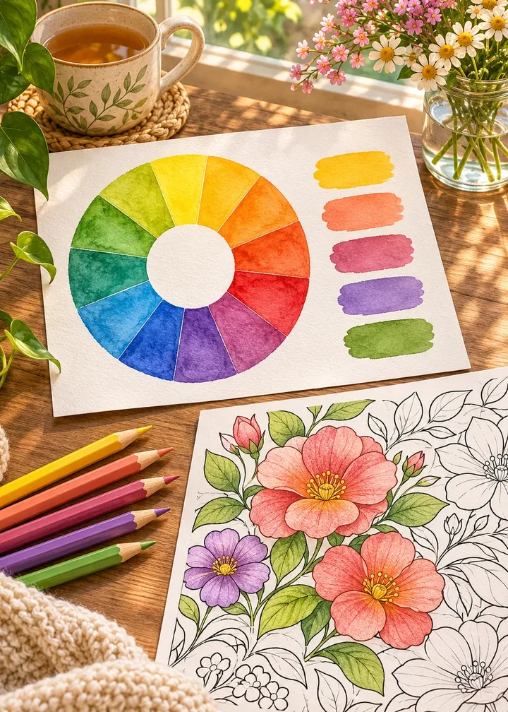
Staring at a blank coloring page with a full box of pencils can be oddly stressful. Every choice seems to close a door, so many colorists reach for the same few favorites and wonder why their pages all look alike.
A color palette for your coloring page solves that. Choosing a small set of colors before you begin turns a hundred tiny decisions into one, and the result almost always looks more harmonious. This method works for any page: a mandala, a garden, a pattern or a portrait of a dog.
In short
- Choose three to seven colors before you start.
- Begin from a mood, a photo or a color wheel scheme.
- Include light, medium and dark values.
- Let one color lead, one support and one sparkle.
- Test on scrap paper or a spare printed copy.
Why a palette makes coloring easier
A palette is a short list of colors you agree to use for one page. It removes decision fatigue: at each new shape you choose among a few colors, not fifty. And it creates unity: colors that repeat across the page tie distant areas together, so even unusual combinations look intentional.
Start from a mood, a memory or a photo
The easiest way to find a palette is to think about a feeling or a place rather than colors:
- A calm morning: pale blue, soft peach, cream and light sage green.
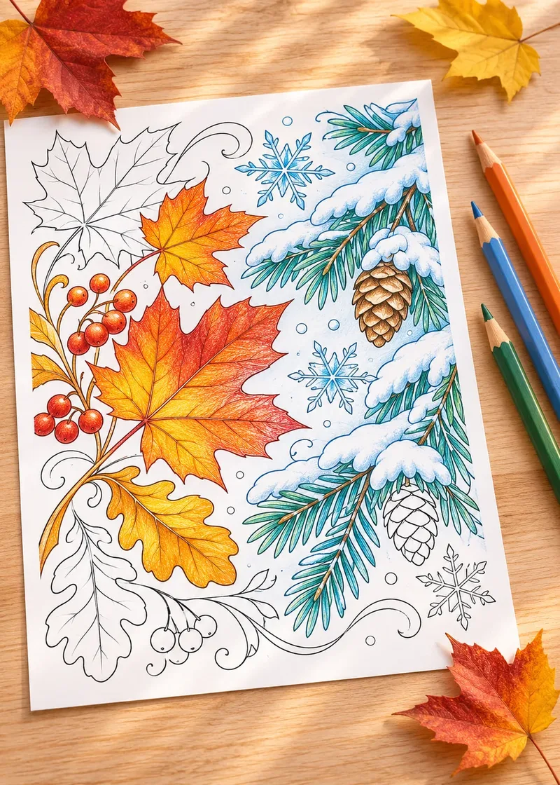
- An autumn walk: rust, mustard, olive and deep brown.
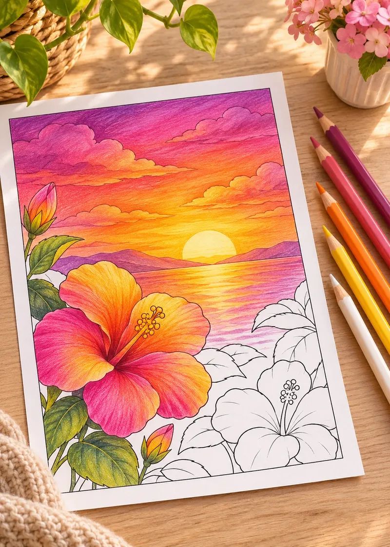
- A summer market: watermelon pink, lime, lemon and turquoise.
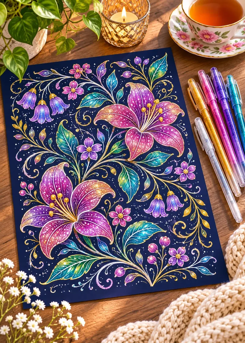
- A quiet evening: navy, plum, dusty rose and a touch of gold.
How to pull a palette from a photo
Photos of a beach, a bowl of fruit or a favorite fabric already contain colors that work together.
From photo to palette
- Pick a photo you love. Simple scenes with a few large areas of color work best.
- Note the main color. Ask which color covers the most of the picture: that is your leader.
- Find two supporting colors. Look for the next largest areas, often a lighter and a darker one.
- Spot one accent. A small bright detail, like a red door or a yellow flower, becomes your sparkle.
- Match each one to a pencil. Swatch them side by side and compare with the photo in daylight.
Color wheel schemes for coloring pages
If you prefer structure, the color wheel offers reliable recipes. Picture the wheel as a clock, with yellow at twelve, red around four and blue around eight.
| Scheme | How to build it | Feel |
|---|---|---|
| Analogous | Three or four neighbors, like yellow, orange and red | Warm, gentle, cohesive |
| Complementary | Two opposites, like blue and orange | Lively, high contrast |
| Split complementary | One color plus the two neighbors of its opposite | Vivid but balanced |
| Triadic | Three evenly spaced colors, like red, yellow and blue | Playful, bold |
| Monochrome | Several values of a single color | Calm, elegant |
Analogous palettes are the easiest start because their colors blend naturally. Complementary ones are striking but need care: let one color dominate and use the other as an accent. Here are three schemes as swatches you can match to your own pencils:
- Mustard
#D9A621main color - Burnt orange
#C8642Bsupport - Rust
#9C3D23shading - Deep brown
#4E3022small accents
- Sky blue
#6FA8DCmain color - Navy
#22406Bshading - Yellow orange
#F2A93Bsupport - Red orange
#D9532Caccent
- Pale teal
#CFE8E4large areas - Soft teal
#7CC2B9most shapes - Teal
#2A8C82shading - Deep teal
#164F4Aoutlines and accents
Balance light, medium and dark
This is the step most people skip, and it makes the biggest difference. Value means how light or dark a color is, regardless of hue. A page made only of medium colors looks flat, even if the hues are beautiful.
A balanced palette includes one or two light colors for large areas and highlights, two or three medium colors for most shapes, and one dark color for depth and small accents.
The squint test
Squint at your chosen pencils or swatches. If they blur into the same gray, add something lighter and something darker.
Value is also what makes shading work. Our guide on how to shade coloring pages shows how to use your darkest color to make shapes look round.
Decide on proportions: the 60-30-10 split
Using every color in equal amounts can feel chaotic. A useful guideline, borrowed from interior design: about 60 percent of the page in your main color, 30 percent in a supporting color and 10 percent in an accent, usually the brightest or darkest.
You do not need to measure anything. Decide which color will lead, which will support and which will sparkle. On a mandala, the main color might fill the outer petals, the support color the middle rings and the accent the dots near the center. The guide on how to color mandalas applies this ring by ring.
Test before you commit
Make a small swatch strip in the margin or on scrap paper: a square of each pencil, then the colors side by side and layered. Colors often look different on paper than on the pencil barrel.
Better still, print the page twice. Block in the main areas loosely on the first copy, step back, then take your time on the second. Free printable coloring pages are ideal for this, since a test costs only a sheet of paper.
Matching the palette to the page
- Patterns and geometric pages shine with a strict rule, such as alternating two colors or moving through a gradient. Pattern pages are perfect for this.
- Mandalas love analogous or monochrome palettes with one bright accent.
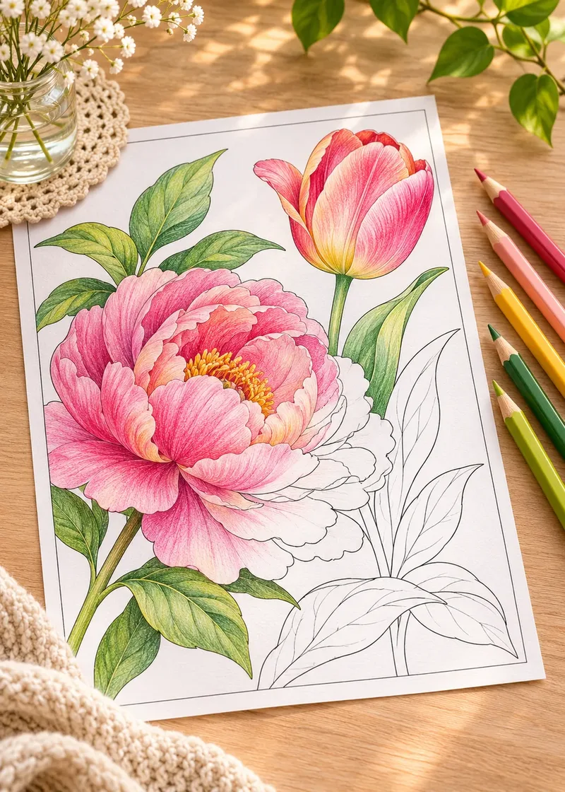
- Nature scenes look natural with muted, slightly grayed colors and a few vivid touches; see how to color flowers realistically.
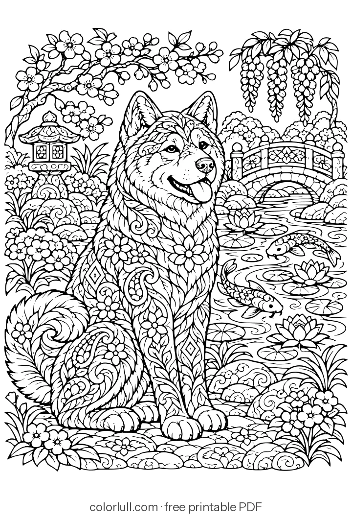
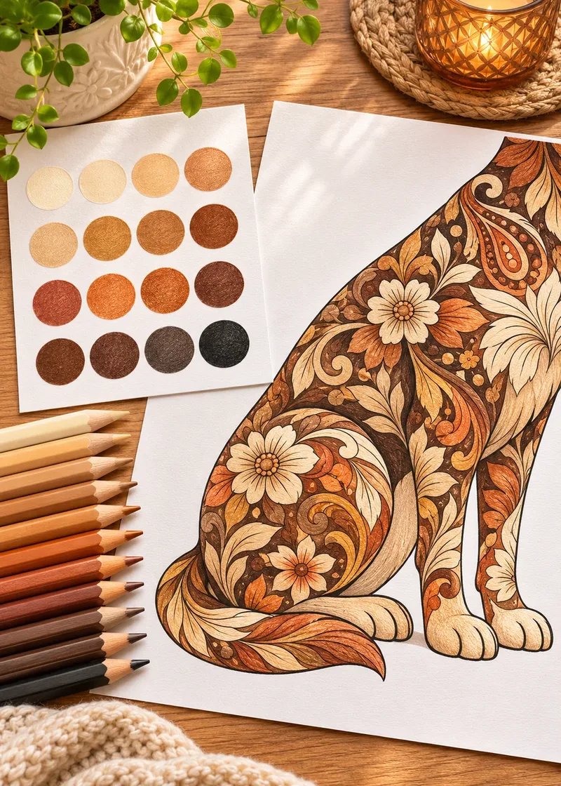
- Animals follow their real coats; our dog coat color palettes give ready recipes.
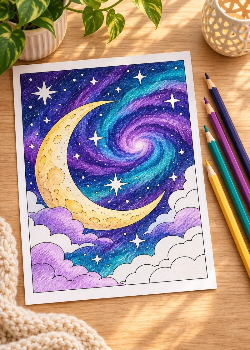
- Night scenes need a dark main color and light accents; the night sky color palettes are ready to use.
Plan the background too
The background is part of the palette. A pale tint of your main color, or the darkest color of the set, keeps the page unified. Our guide on how to color backgrounds walks through the options.
When a palette is not working
Halfway through, the page feels off? Before you abandon it:
- Add a dark. A few strokes of a deep color in small areas often fixes a washed-out page.
- Repeat the odd color. Use it in two or three more spots and it starts to look deliberate.
- Calm the background. A busy page often needs a quieter, lighter background.
Frequently asked questions
How many colors should a coloring palette have?
Three to seven is a comfortable range. Fewer colors look calm and unified; more colors work if you keep one clear leader and a single dark.
What colors go well together for coloring?
Neighbors on the color wheel, like blue, teal and green, always go well together. For more energy, pair a color with its opposite, such as blue with orange, and let one of them dominate.
How do I stop my coloring pages from looking flat?
Add value contrast. Make sure your palette has at least one light and one dark color, and use the dark one for shadows and small accents.
Can I use a photo to choose colors?
Yes. Pick the color that covers most of the photo as your main color, add two supporting colors and one small bright accent, then match each one to a pencil.
Should every page use a different palette?
Not necessarily. Reusing a palette you love across a series of pages, such as a set of mandalas, makes them look like a matching collection.