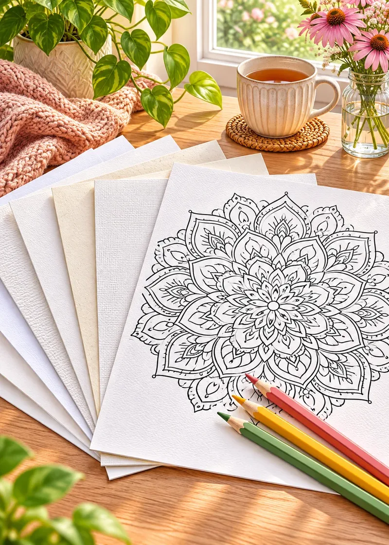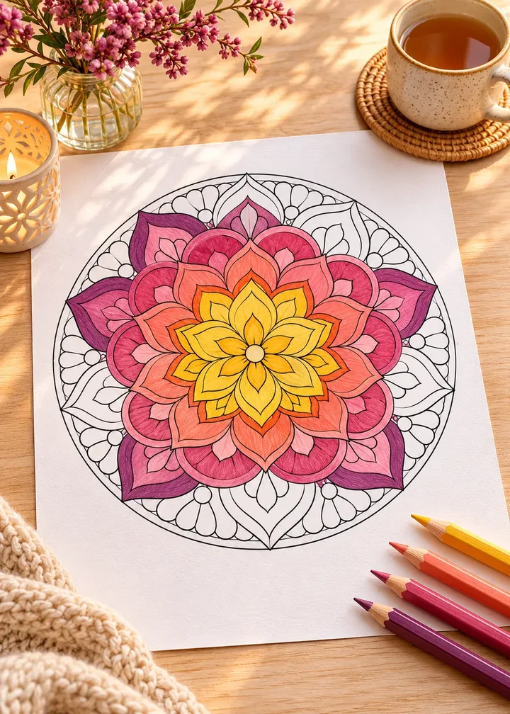
Mandalas are the classic coloring design for good reason. Their circular, repeating patterns are easy to start, calming to fill, and look beautiful with almost any palette. Yet a mandala can also feel overwhelming: hundreds of small shapes, all waiting for a decision.
This guide gives you a simple system for coloring mandalas, from planning a palette to working ring by ring, plus a few tricks to add depth and keep the result balanced.
In short
- Pick three to six colors before you begin.
- Work from the center out or the outside in, and stay consistent.
- Color one motif, then repeat it all around the ring.
- Alternate light and dark rings for contrast.
- Shade petals toward the center and keep tips light.
What makes mandalas different
A mandala is built from rings around a center, and each ring repeats the same motif several times. That structure is your best friend. You make a color choice once, then repeat it around the circle. The repetition is what makes mandalas so soothing: your hands stay busy while your mind settles into a rhythm.
Mandalas forgive mistakes
One slightly different petal disappears into the overall pattern. If a color goes somewhere you did not plan, repeat it in the matching motifs and it becomes part of the design.
Step 1: Choose a palette before you start
Pick a small palette, three to six colors, and lay the pencils out in front of you. A limited palette is the single biggest difference between a mandala that looks harmonious and one that looks busy.
Here are four palettes that work well on mandalas:
- Sunset warmth: golden yellow, apricot, coral, deep rose, with a touch of plum.
- Ocean calm: pale aqua, turquoise, teal, navy, with white left open.
- Garden fresh: lemon, spring green, sage, forest green, with a pop of pink.
- Jewel tones: emerald, sapphire, amethyst, ruby, with gold accents.
Two of them, with colors you can match against your own pencils:
- Pale aqua
#CDEBE7outer ring - Turquoise
#3FB8AFpetals - Teal
#1F7A7Ashading - Navy
#1F3A5Fcenter accent - White
#FFFFFFleft open
- Golden yellow
#F2B630center - Apricot
#F5A26Binner petals - Coral
#EE6F5Bmiddle ring - Deep rose
#B8405Eshading - Plum
#6B3A5Dsmall accents
Tip
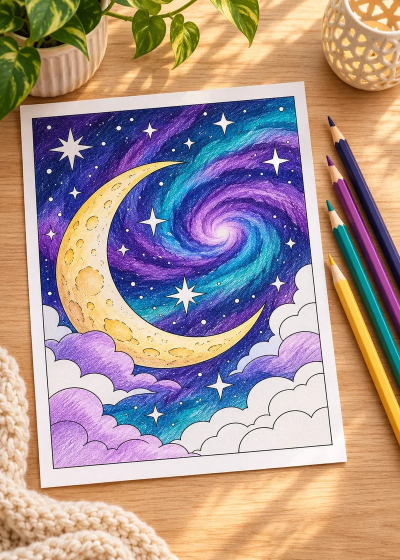
If you are unsure, choose colors that sit side by side on the color wheel and add one contrasting accent. For a night-inspired twist, our night sky palette ideas also work beautifully on mandalas.
Step 2: Decide your direction
There are two good ways to work through a mandala.
From the center out
Starting in the middle lets you set the mood with the focal point, then build outward. It feels natural, and you can adjust the palette as you go. The risk is smudging the center with your hand, so keep a scrap sheet under your palm.
From the outside in
Starting with the outer ring keeps your hand off finished areas, which matters with markers or soft pencils. It also lets the center become a final, satisfying highlight.
Either works. Choose the one that feels comfortable and stick to it for the whole page.
Step 3: Color ring by ring, motif by motif
Treat each ring as a unit. Pick a color for one motif, then repeat it in every matching motif around the circle before moving on. This keeps the symmetry intact and gives you a satisfying sense of progress.
A few patterns to try within a ring:
- Solid repeat: every petal in the same color. Simple and calm.
- Alternating: two colors, one after the other, around the ring. Adds rhythm.
- Gradient around the circle: shift gradually from one color to the next as you go around, like a color wheel.
- Gradient inside each petal: dark at the base, light at the tip. Adds depth without changing the pattern. More on light and shadow in how to shade coloring pages.
Step 4: Create contrast between rings
Neighboring rings look best when they contrast in value, light next to dark, not only in color. If one ring is pale yellow, try a deep teal or rose in the next.
The squint test
Squint at the page now and then: if everything blends into one mid-tone, add a darker ring to separate the pattern.
Leaving one ring white, or very pale, can be just as effective as a bold color. It gives the eye a place to rest.
Step 5: Add depth with simple shading
A few small touches make a mandala look almost three-dimensional:
Three shading moves
- Shade toward the center. Darken each petal slightly where it meets the inner ring, as if it tucks underneath.
- Highlight the tips. Keep petal tips lighter, or leave a tiny spot of white.
- Use a darker version of the same color. Shade with it rather than with gray or black.
Our guide to colored pencil blending explains how to make these transitions smooth.
Balancing the whole design
Symmetry already gives a mandala balance, but color distribution matters too. Try to spread your strongest accent color evenly: if a bright pink appears in the center, repeat it in one or two outer rings so the eye travels across the whole design. A single bright ring with nothing to echo it can make the page feel lopsided.
Tools that suit mandalas
- Colored pencils are ideal for gradients and fine detail.
- Fine-tip markers give bold, flat color and are fast on small shapes. Use cardstock and one-sided pages.
- Gel pens are perfect for small dots and accents in the final stage, especially metallic or white ones.
If you print mandalas at home, a slightly heavier paper helps. See our guide to the best paper for printing coloring pages.
Choosing the right mandala for your mood
Not every evening calls for an intricate design.
- Bold and simple mandalas with large shapes are perfect when you are tired or short on time.
- Medium detail suits a relaxed weekend afternoon.
- Intricate mandalas with tiny spaces are rewarding when you want deep focus, but split them across several sessions.
Mandalas reward a relaxed, repetitive rhythm. Put on some quiet music, pick a palette, and let the circle fill itself one petal at a time.
Frequently asked questions
How many colors should I use on a mandala?
Three to six is a comfortable range. A small palette repeated ring by ring looks harmonious; a dozen colors on one page tends to look busy. You can always add a single accent color at the end.
Should I start coloring a mandala from the center or from the edge?
Either works. Starting at the center lets you set the mood with the focal point; starting at the outer ring keeps your hand off finished areas, which helps with markers and soft pencils. Pick one direction and keep it for the whole page.
What are the best tools for coloring mandalas?
Colored pencils are ideal for gradients and fine detail. Fine-tip markers give bold, flat color on small shapes; use them on one-sided pages or cardstock. Gel pens are perfect for dots and highlights in the final stage.
How do I keep a mandala from looking busy?
Contrast light and dark between neighboring rings, leave one ring white or very pale to give the eye a rest, and repeat your strongest accent color in two or three places so it feels balanced.
How long does it take to color a mandala?
It depends on the design. A bold mandala with large shapes can be finished in one relaxed evening, while an intricate one with tiny spaces is best split across several sessions.